
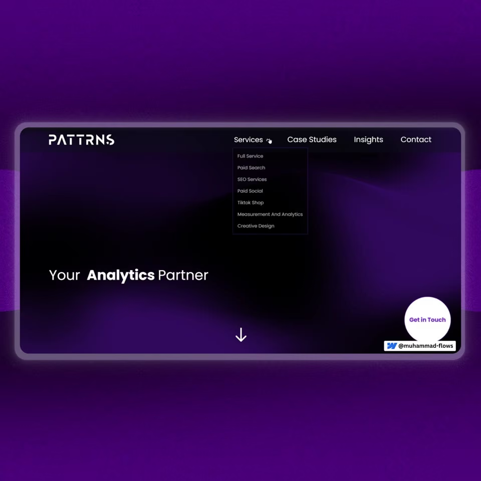
pattrns.

A clearer website for a full-service marketing agency.

Creative development and a Webflow build that give the agency's services, client work and team a consistent home, with interaction that adds character without hiding the offer.

  • Creative development
  • Webflow development
  • Interaction design

The brief behind the build.

pattrns needed to present a broad digital marketing offer without making visitors work through a wall of information. Services, client results, team experience and editorial content all needed a clear role in the website.

Our scope covered creative development, Webflow development and interaction design. The challenge was to make those parts feel like one experience: distinctive at the top, straightforward to browse and consistent as visitors moved into services and case studies.

How we built it.

Explore the main parts of the build.

The build brings an expressive first impression together with familiar navigation and reusable content patterns. Services explain the offer, client work supplies context and the people behind the agency make the business more tangible.

An animated introduction to the offer

The hero cycles through the agency's areas of expertise inside a stable partner statement. A fluid background gives the opening its character, while the contact action and main navigation remain easy to identify.
Services in a browsable carousel

Service cards combine a clear title, a short description and supporting points. The slider lets visitors explore the breadth of the offer without turning the homepage into a long catalogue of service descriptions.

Client feedback beside the work

The homepage includes a client feedback slider followed by selected case studies. The work cards link through to fuller stories, giving visitors a route from an introduction to the agency to examples of its client work.

Consistent structures for work and insights

Reusable cards organise case studies and articles with a shared hierarchy of category, title and short description. The Webflow structure gives different content types their own destinations while keeping the browsing experience familiar.

People and contact kept visible

A team carousel introduces the people behind the services. Contact remains a clear route in the navigation and hero, so visitors who have seen enough can take the next step without completing the whole page.

The decisions behind the website.

The details that shaped the finished build.

  1. 01

    Make the offer visible in the hero

    Cycle the areas of expertise within one stable headline structure. The animation gives the agency personality without asking visitors to decode an abstract brand statement.

  2. 02

    Group services into readable cards

    Give each service the same basic structure: a name, a short explanation and supporting detail. Visitors can compare the options before opening a dedicated service page.

  3. 03

    Let visitors control the carousels

    Visible previous and next controls give the service, feedback and team sections a familiar browsing pattern. The interaction supports exploration instead of relying on a visitor discovering a hidden gesture.

  4. 04

    Connect credibility with relevant work

    Place client feedback and selected projects in the main reading flow. These sections show the agency in context, while the case-study links leave room for the full story on a separate page.

  5. 05

    Use reusable content patterns

    Keep card hierarchy and spacing consistent across work and editorial content. The subject can change without forcing visitors to learn a new way to browse each section.

  6. 06

    Keep the contact route straightforward

    Use recognisable service, work, insights and contact routes. The expressive parts of the design sit within a navigation structure that makes the business easy to explore.

What changed.

pattrns has a Webflow website that brings its offer, people, client feedback and selected work into one consistent experience. Visitors can browse the agency at a glance or follow a clear route into a more detailed service or case study.

Shared content patterns hold the site together as visitors move between services, work and insights. The result is an agency website with room for varied content, without a different visual language for each section.

Have a similar project in mind?

Tell us about your business, what needs to change and what you liked about pattrns.. We will help you agree a scope and estimate before work starts.

You will speak directly with Muhammad Waleed Jamshed, who leads Al Kasib.

View the contact page for project enquiries.

Tell us what you need.

A few details are enough to start.

Your contact details
Project scope

Your details are sent to Al Kasib and stored to respond to your enquiry, not for automated marketing.Privacy notice

Thanks. We will be in touch.

More work to explore.

See the scope and story behind another project.

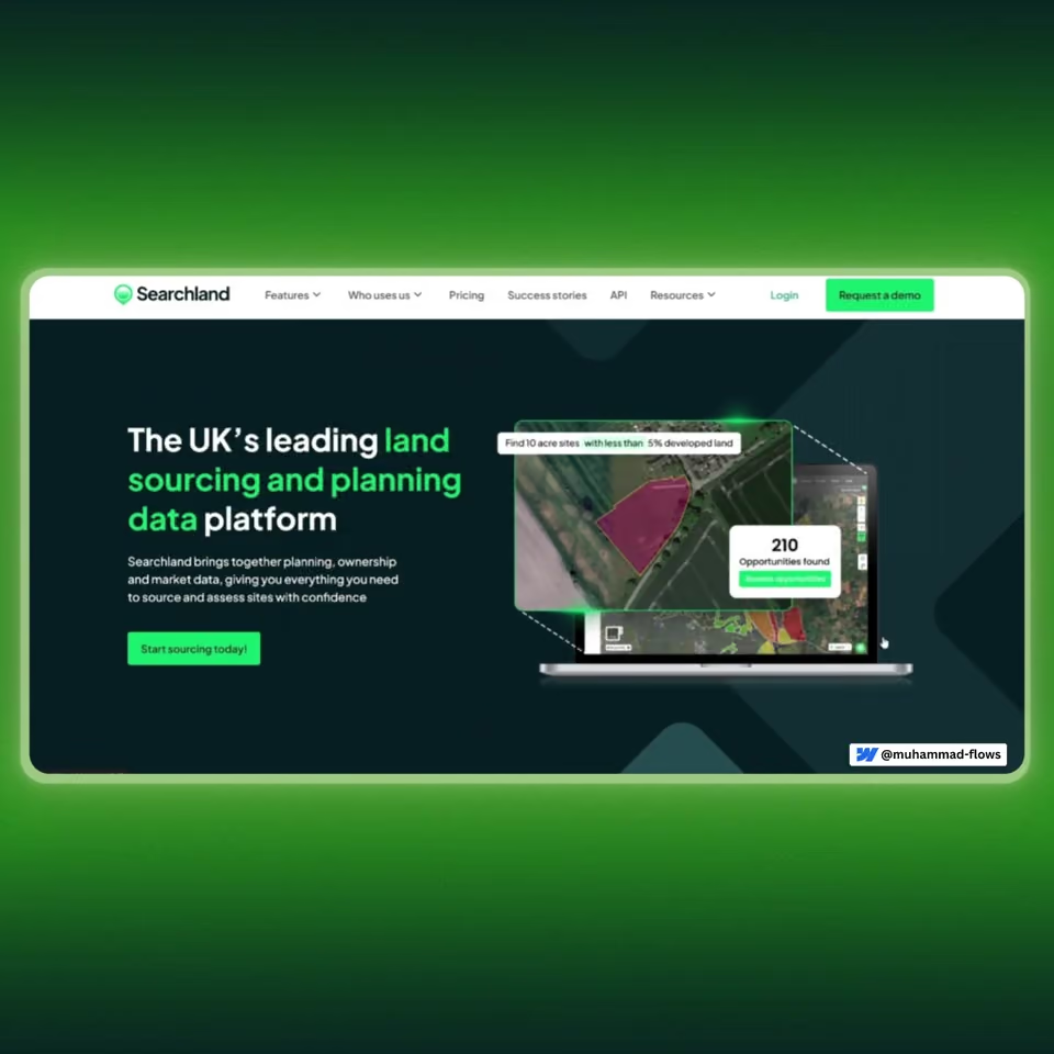
Searchland

Project scope: Design to Webflow · Scalable CMS · Micro-interactions · CMS Filters

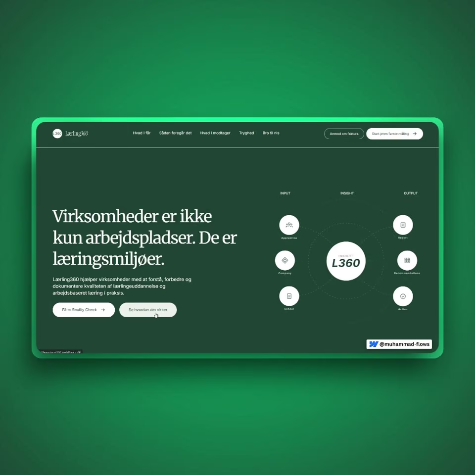
Lærling360

Project scope: Full Design & Build · SaaS Landing Page · Danish Market